To get perfect symmetry in Inkscape model only one half, and make sure all the nodes on the symmetry axis line up by selecting them all and just setting the X-position for all of them at once. Copy the whole thing, CTRL+ALT+V (to paste in place) and sign the width with a minus to mirror it. If you enable snapping in the toolbar on the right you can then just align it easily. There will be a noticable seam inbetween the two halves though, but you can just combine the objects to get rid of it. Hope that helps

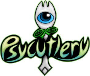
Now onto the logo itself - it looks a lot better than what you had previously! I'm not really too fond on the outline effect myself, though. For one, I think it'd be best to animate it ingame, but even for a stand-alone image to put into sigs, the effect looks... unfitting? It doesn't really look psychic to me, personally, more like... electrifying? I'd go with something similar to Psychonauts myself, which was radial blur if I'm not mistaken? Aside from that, I can't help but feel like it's a bit left-heavy... ironically that never bothered me with the old logo but it does here as there's supposed to be some symmetry. Maybe try sizing down the "Psy" part? Idk, it might be just me. Other than that, everything's fantastic. Especially the spork itself looks great

EDIT: As for a more horizontal alternative logo to use in sigs, maybe replace the t with the spork? The spork kind of has that t-shape with the bow.
To get perfect symmetry in Inkscape model only one half, and make sure all the nodes on the symmetry axis line up by selecting them all and just setting the X-position for all of them at once. Copy the whole thing, CTRL+ALT+V (to paste in place) and sign the width with a minus to mirror it. If you enable snapping in the toolbar on the right you can then just align it easily. There will be a noticable seam inbetween the two halves though, but you can just combine the objects to get rid of it. Hope that helps :)
Now onto the logo itself - it looks a lot better than what you had previously! I'm not really too fond on the outline effect myself, though. For one, I think it'd be best to animate it ingame, but even for a stand-alone image to put into sigs, the effect looks... unfitting? It doesn't really look psychic to me, personally, more like... electrifying? I'd go with something similar to Psychonauts myself, which was radial blur if I'm not mistaken? Aside from that, I can't help but feel like it's a bit left-heavy... ironically that never bothered me with the old logo but it does here as there's supposed to be some symmetry. Maybe try sizing down the "Psy" part? Idk, it might be just me. Other than that, everything's fantastic. Especially the spork itself looks great :D
EDIT: As for a more horizontal alternative logo to use in sigs, maybe replace the t with the spork? The spork kind of has that t-shape with the bow.


![[zz]](./images/flags/zz.gif "Undefined") Psid
Psid


 Thanks! And Thanks everyone!
 ![[au]](./images/flags/au.gif "Australia") Kritter
Kritter


![[aq]](./images/flags/aq.gif "Antarctica") Thunder Dragon
Thunder Dragon


![[us]](./images/flags/us.gif "United States") Zae
Zae


![[at]](./images/flags/at.gif "Austria") DJ Coco
DJ Coco