|
That's a version number for you.
Hey kids, as it's such a special day I'm giving you a work-in-progress skin. It's Blue Challenger (a.k.a. the default skin) but with all sorts of funky enhancements, cultivating in a package cleverly titled "Blue Challenger 2.0". The plan is to eventually have 2.0 replace "1.0", but unlike certain video game companies as of late, my definition of 2.0 is "better than 1.0 in every possible way". Or at least most ways. I have never been completely satisfied with the current default skin so hence the changes.
Problem is, I'm only one man, and the staff are only a few extra men, so I'm opening it up for the masses to dig in and test out. You can change skins via the User CP. I'd like constructive feedback.
Blue Challenger 2.0 is an extension of 1.0. It's mostly the same, but better. The big feature is that requires roughly a third less vertical scrolling because I (tried) to remove wasted space. It is severely limited for a number of reasons though, which I'll get onto in a bit. Other big-ish changes include a few font size tweaks, the occasional new image or two, and prettier quotes. It is primarily designed with modern browsers in mind - if you're using a modern browser and things aren't looking as they should, speak up, but if you're using something like IE6 or Firefox 1.0 you're going to get a gimped experience and I don't care.
ERRORS I ALREADY KNOW ABOUT
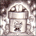
- The "breadcrumbs" table, i.e. that purple box with the mushroom which reads "Board Index >> MFGG >> etc", floods into user profile pages and some other things.
- The sections below the logo look ugly.
- Alignment is a bit off in places
- there's an image or two that's defaulting to Techo's set
- I think things might be a bit too purple. But at the same time, I don't think it would work too well if everything was blue, despite its name.
Some of this is due to the fact it shares the same template with every other skin on site (bar Char's Simplistic Green). Changing a feature to suit one skin could ruin others, so there needs to be some balance.
Remember that I am not attempting to radically overhaul the look of MFGG - just enhance it. Radical overhauls would be best delivered in the form of brand new skins.
oh and while I'm here, if you spot errors in any of the other skins I may take this time to fix them. Lots were designed with old CRT displays in mind, running at 1024x768, and they're not standards now.
That's a version number for you.
Hey kids, as it's such a special day I'm giving you a work-in-progress skin. It's Blue Challenger (a.k.a. the default skin) but with all sorts of funky enhancements, cultivating in a package cleverly titled "Blue Challenger 2.0". The plan is to eventually have 2.0 replace "1.0", but unlike certain video game companies as of late, my definition of 2.0 is "better than 1.0 in every possible way". Or at least most ways. I have never been completely satisfied with the current default skin so hence the changes.
Problem is, I'm only one man, and the staff are only a few extra men, so I'm opening it up for the masses to dig in and test out. You can change skins via the User CP. I'd like constructive feedback.
Blue Challenger 2.0 is an extension of 1.0. It's mostly the same, but better. The big feature is that requires roughly a third less vertical scrolling because I (tried) to remove wasted space. It is severely limited for a number of reasons though, which I'll get onto in a bit. Other big-ish changes include a few font size tweaks, the occasional new image or two, and prettier quotes. It is primarily designed with modern browsers in mind - if you're using a modern browser and things aren't looking as they should, speak up, but if you're using something like IE6 or Firefox 1.0 you're going to get a gimped experience and I don't care.
ERRORS I ALREADY KNOW ABOUT
- The "breadcrumbs" table, i.e. that purple box with the mushroom which reads "Board Index >> MFGG >> etc", floods into user profile pages and some other things.
- The sections below the logo look ugly.
- Alignment is a bit off in places
- there's an image or two that's defaulting to Techo's set
- I think things might be a bit too purple. But at the same time, I don't think it would work too well if everything was blue, despite its name.
Some of this is due to the fact it shares the same template with every other skin on site (bar Char's Simplistic Green). Changing a feature to suit one skin could ruin others, so there needs to be some balance.
Remember that I am not attempting to radically overhaul the look of MFGG - just enhance it. Radical overhauls would be best delivered in the form of brand new skins.
oh and while I'm here, if you spot errors in any of the other skins I may take this time to fix them. Lots were designed with old CRT displays in mind, running at 1024x768, and they're not standards now.
_________________
|


![[gb]](./images/flags/gb.gif "United Kingdom") Black Squirrel
Black Squirrel


 are
are  now
now  aligned
  correctly
![[us]](./images/flags/us.gif "United States") VinnyVideo
VinnyVideo


![[kp]](./images/flags/kp.gif "North Korea") Super Mario WTL
Super Mario WTL

![[ca]](./images/flags/ca.gif "Canada") DJ Yoshiman
DJ Yoshiman
![[tw]](./images/flags/tw.gif "Taiwan") Hypernova
Hypernova


![[au]](./images/flags/au.gif "Australia") Kritter
Kritter