That looks really great, Simpson55! I love the colors you used.

The only negative things I can add is the shading of the ground tiles. They appear to have banding (which is basically shading that is just directly based off of a shape), which doesn't really make it look natural and instead looks flat. Maybe you could try to only shade areas where you think must really need it. Also, I find it weird that the waves just get cut off in certain areas. I think adding some shades on the sides would make the waves in certain areas not look cut off anymore.
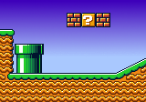
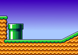
That looks really great, Simpson55! I love the colors you used. :thumbsup: The only negative things I can add is the shading of the ground tiles. They appear to have banding (which is basically shading that is just directly based off of a shape), which doesn't really make it look natural and instead looks flat. Maybe you could try to only shade areas where you think must really need it. Also, I find it weird that the waves just get cut off in certain areas. I think adding some shades on the sides would make the waves in certain areas not look cut off anymore.


![[fr]](./images/flags/fr.gif "France") Simpson55
Simpson55


![[br]](./images/flags/br.gif "Brazil") SuperArthurBros
SuperArthurBros


![[zz]](./images/flags/zz.gif "Undefined") Q-Nova
Q-Nova


![[us]](./images/flags/us.gif "United States") Willsaber
Willsaber